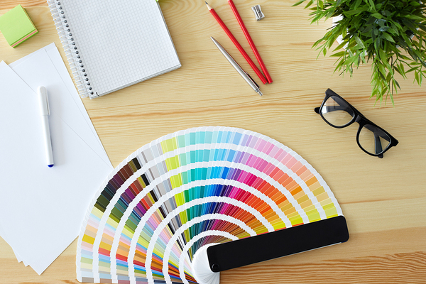
Humans are hardwired to respond to color. What that response will be differs from culture to culture and even gender to gender, but the bottom line is that color does produce an emotional response. For this reason, it is important to put careful thought into your color choice for food packaging design. As it turns out, humans really do eat first with their eyes. How a food looks is one of the first sensory criteria humans use to make decisions about a food purchase.
Color Impacts Consumer Choice
Kissmetric’s “How Colors Affect Conversions” notes that approximately 93 percent of people say the visual dimension is the main influencing factor affecting their purchase decision, and that people make a subconscious judgment about a product within 90 seconds of initial viewing. Up to 90 percent of that assessment is based on color alone.
According to a recent Inc. article, 80 percent of consumers believe that color increases brand recognition, meaning that it is extremely important to get the color right in your package design to cement the relationship between your products and your overall brand message.
How Color Affects Mood
Though all humans experience color in an individual way, there are some broad patterns that hold true for the majority of the population regarding color choice. Here is a quick run-down of colors and their associated emotional responses:
o Blue: Calm, honest, caring, warm
o Red: Exciting, energetic, passionate
o Orange: Social, happy, friendly, affordable
o Yellow: Playful, optimistic, confidant
o Green: Natural, fresh, organic
o Purple: Imaginative, creative
o Black: Luxurious, authoritative
o Brown: Nurturing, earthy
Within these broad ranges, there are many variations in tint, shade and tone that evoke a weaker or stronger emotional response. The emotional reaction inherent in human perception to color is the very basis of color theory, a scientific approach to color in design and visual arts.
How to Pick the Best Color for Your Package Design
No one color perfectly represents everything about your brand. However, since color undeniably sends signals about your product, it is important that those signals align with the message you want to convey.
For instance, if you want your food product to be associated with freshness or purity, you might choose green and white as part of your package design. But what tint or shade of green works best? What should the proportion of green to white be? These are all vital considerations with even the most basic design.
The decisions you make regarding the color palette you will use for your food packaging can often be the single most important factor affecting whether your product sells quickly or gathers dust on a shelf. If you question whether that is true, consider this example. When Heinz changed the color of their signature ketchup label from red to green, the company sold over 10 million bottles in the first 7 months, resulting in $23 million in sales. The takeaway? Color matters.
Putting Emotion into Package Design
How can you ensure that your food package design will evoke the right response from consumers? How can you know that you will be striking the right emotional chord?
A version of this article originally appeared on www.hangar-12.com.


