Client

Agency

Problem
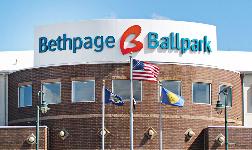
Austin & Williams was contacted by Bethpage, a $3 billion Federal Credit Union based in Long Island, New York. Their existing research showed two things: First, their members loved them. Second, virtually no one else in their crowded marketplace knew they existed.
SOLUTION
We developed a marketing campaign with a contemporary yet friendly brand identity. The Bethpage logo we created features a teal and bright orange color palette, which stands out from the sea of blue that so many banks have adopted, while the “You’ll love banking here.” tagline is a true differentiator. Few financial institutions could deliver on such a bold statement—Bethpage did. The credit union’s superior service message was brought to life—literally—in the new “faces” of Bethpage: The iconic Beth and Paige.
As the focal point of the campaign, the two women personified the essence of the new brand strategy with their personal commitment to going “above and beyond” to deliver great service, even in challenging situations. The pair were featured in all advertising, merchandising and collateral materials while demonstrating the knowledgeable, approachable and service focus of Bethpage employees. Some radio spots were even based on real “above and beyond” stories we heard from the staff.

Results
Seven months after we launched their rebranding campaign, more Long Islanders than ever not only knew them—they loved them. According to independent research conducted by Bethpage: Bethpage’s unaided awareness was at 52%, making it more “top of mind” than all but one of their “big bank” market competitors. More than eight in 10 consumers on Long Island recognized Bethpage. Consumers perceived Bethpage as the knowledgeable, friendly place to bank. The campaign also boosted membership, brought in millions in new CD deposits, exceeded all consumer auto and business loan projections—and was recognized with a CUNA Diamond Award as well as seven international Telly Awards for outstanding TV advertising.


